
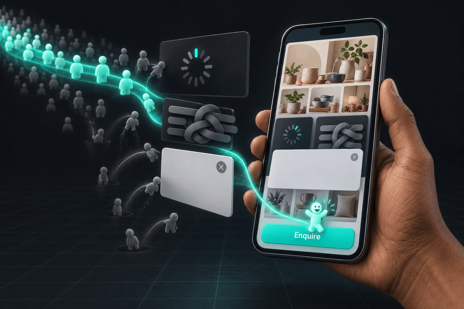
A few weeks back, a man who runs a modular kitchen showroom in Indore sent me screenshots on WhatsApp. His website was pulling almost 4,000 visitors a month from Google, plenty of "near me" searches, rankings he was genuinely proud of. Calls that month? Six. He was sure he needed more traffic. He didn't. He had a handful of website UX mistakes quietly turning interested people away at the door.
This is the bit most owners get wrong. When the phone goes quiet, the instinct is to buy more ads or chase more visitors. But if your site already gets traffic and almost nobody enquires, the leak is on your side of the screen. Traffic without enquiries is rarely bad luck. It is usually usability.
I run a small web and marketing studio, and I see this same pattern everywhere - a saree shop in Surat, a physiotherapy clinic in Nagpur, a CA firm in Patna. The traffic shows up, then slips away. So let me walk you through the nine website UX mistakes I run into most on Indian SMB sites, what each one looks like in your analytics, and exactly how to fix it. No jargon. Think of it as a chat over chai.
What these website UX mistakes look like in your analytics
You don't have to guess. Your numbers already tell the story, if you know where to look. Open Google Analytics or Search Console and watch three things.
Bounce and exit rates. A bounce is someone who lands and leaves without doing a thing. The cross-industry median bounce rate in 2026 sits around 47%, and mobile bounces higher - about 52% versus 40% on desktop. If your mobile number is well past that, you have your answer for why website visitors leave before they ever enquire.
Dead clicks and rage clicks. A free tool like Microsoft Clarity shows you where people tap something that isn't a button, or angrily jab the same spot again and again. That little burst of frustration is real money walking out.
Time spent near your contact section. If visitors reach your enquiry form and vanish within seconds, the form is the problem, not the visitor. Good website usability for small business owners isn't a luxury. It is the difference between a busy week and a dead one.

Mistake 1: A site that loads too slowly
This is the big one, and the most common. In India most of your visitors are on mobile data, often on a patchy signal in a Tier-2 or Tier-3 town. Make them wait and they are gone before they see a single bit of your work.
The numbers are brutal. Google found that 53% of mobile visitors abandon a page that takes more than three seconds to load, and the chance of a bounce climbs by about a third as load time creeps from one second to three. Close to 40% of all visitors simply give up. Every extra second is enquiries you paid for and lost.
The fix. Compress your images - plenty of SMB sites are carrying 3 MB hero photos that should weigh 200 KB - turn on caching, ditch the cheap shared hosting, and cut the bloated page builder. If the site is built on a slow, plugin-heavy template, patching it often costs more than starting clean. A fast, mobile-first website development rebuild usually pays for itself, and it is the single biggest lever you have to reduce website bounce rate.
Mistake 2: A mobile layout that is broken or clumsy
More than half of India's web traffic is mobile, and for a lot of local businesses it is closer to 80%. Yet so many sites are still designed on a laptop and never properly checked on a phone. Text runs off the edge. Buttons sit on top of each other. A popup swallows the screen with a close button you can't actually reach.
Pull out your own phone and open your site the way a customer would. Can you read it without pinching to zoom? Can you tap the call button with your thumb while holding a cup of chai? If you can't, neither can they.
The fix. Mobile-first design isn't optional any more. Your offer, your number, your enquiry button - all of it should be reachable with one thumb in the very first screen. When the current site simply can't do that, a clean mobile-first rebuild solves it for good rather than for a fortnight.
Mistake 3: Confusing navigation and a menu with too many items
A confused visitor never buys. When your menu carries fourteen items - Home, About, Our Story, Our Journey, Vision, Gallery, Media, Awards - people don't feel informed. They feel lost. They came to learn whether you can solve their problem and how to reach you. The rest is noise.
The fix. Trim the menu to five or six clear items. Services. Work. About. Contact. Use the words your customers use, not clever internal names. Every page should make the next step obvious. Clean navigation is core structure work in any solid website development project, never an afterthought.
Quick gut-check: if you've already nodded at three of these, your site isn't failing because you were careless. It is just built on an old foundation. Want a second pair of eyes? You can book a free 20-minute call and I'll tell you honestly whether yours is a patch job or a rebuild.
Mistake 4: No obvious call-to-action or enquiry path
Here's a number that should sting. Roughly 70% of small business websites have no clear call-to-action. People land, read, nod, and then nothing tells them what to do next. So they leave.
Your visitor should never have to hunt for how to reach you. One primary action, repeated calmly down the page: Get a Free Quote. Book a Visit. WhatsApp Us. A button people see above the fold gets noticed far more than one buried at the very bottom.
The fix. This is where sharp words and clean design earn their keep. Punchy CTA copywriting paired with clear buttons and icons can lift enquiries without a single extra visitor. Tell people exactly what happens when they tap.
Mistake 5: Walls of text with no visual hierarchy
Nobody reads a website like a novel. They scan. When a page is one long grey slab of text - no headings, no spacing, no images - the eye gives up and the thumb finds the back button.
The fix. Break it up. Short paragraphs. Clear subheadings. A few real photos of your actual work, your actual shop, your actual team. White space is not wasted space - it is what makes the important lines pop. This is equal parts tight writing and thoughtful design.

Mistake 6: Intrusive popups and autoplay everything
You know the feeling. You open a site and instantly a popup begs you to subscribe, a video blasts audio, a chat window slides in, and a "10% off" banner eats whatever is left. On a phone, all at once, it is unusable. Google also dislikes intrusive mobile popups, so you can lose rankings on top of visitors.
The fix. One ask at a time. If you must use a popup, let it appear after someone has actually read something, make the close button big and obvious, and never autoplay sound. Respect a visitor's attention and they will stick around long enough to enquire.
Mistake 7: No trust signals - reviews, address, GST, real photos
An Indian customer about to spend Rs 40,000 wants proof you are real before they call. A site with no address, no real photos, stock images of strangers in suits, and not one review feels risky. 88% of consumers are less likely to return after a single bad experience, and "this looks dodgy" is a bad experience.
The fix. Put your credibility on display. Real photos of your team and premises. Your full address and a Google Map. Your GST number in the footer. Screenshots of genuine Google reviews and a link to your Google Business Profile. Well-designed trust badges and review icons do a lot of quiet convincing - a job worth handing to proper graphic design and clear content writing.
Mistake 8: Enquiry forms that ask for far too much
Name, email, phone, company, city, pin code, budget, how-did-you-hear-about-us, and a captcha that seems to hate you - by field four, most people quit. Every extra box is one more reason not to bother. Forms with three fields or fewer convert best.
The fix. Ask for the bare minimum to start a conversation: name and phone, maybe one line on what they need. You can get the rest once they reply. Better still, let people choose how to reach you - a short form, a tap-to-call, and a WhatsApp button that opens a chat in one tap.
Mistake 9: No WhatsApp or call button on the phone
This is India. A huge share of buyers would far rather fire off a WhatsApp message than fill a form or even make a call. If your mobile site has no sticky WhatsApp button and no tap-to-call button always in reach, you are pushing people down the one path they like least.
The fix. Add a floating WhatsApp button and a click-to-call button that follow visitors as they scroll. Then wire up proper lead capture so enquiries land in one place instead of getting lost. A bit of app and WhatsApp lead-capture integration turns your site from a brochure into something that actually books work.
And when the experience is fixed but you still aren't showing up for "near me" searches? That's a ranking problem, not a UX one. Steady SEO and digital marketing takes it from there - and in 2026 you also want to be visible inside AI answers, which is exactly what generative engine optimization for Indian businesses is about.
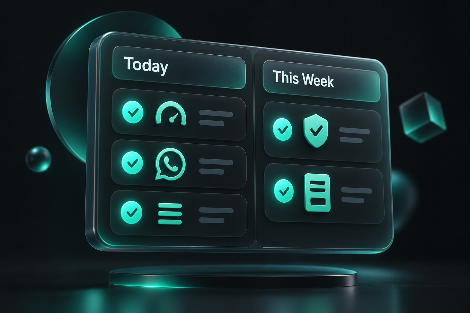
Your fix-it checklist: one day versus one week
You don't have to fix every one of these website UX mistakes at once. Here's how I'd split it.
What you can fix in a day:
- Add a sticky WhatsApp button and a tap-to-call button on mobile.
- Compress your heaviest images and delete the autoplay video.
- Cut your menu down to five or six clear items.
- Put one obvious call-to-action above the fold on every page.
- Add your address, GST number and a few real Google reviews.
What is worth a week, with a little help:
- A proper mobile-first rebuild if the site is slow at its core.
- Rewriting your key pages so they scan easily and lead with the offer.
- Trimming every form to three fields or fewer.
- Designing clean trust badges, icons and CTA buttons.
- Setting up lead capture so not one enquiry slips through.
FAQ
What are the most common website UX mistakes that cost small businesses customers?
The big ones are slow loading, a broken or clumsy mobile layout, confusing navigation, no clear call-to-action, walls of text, intrusive popups, missing trust signals, over-long enquiry forms, and no WhatsApp or call button on mobile. Most Indian SMB sites have at least three of these running at once.
Why does my website get traffic but no enquiries?
If visitors arrive and leave without contacting you, the problem is usually usability, not traffic. Slow pages, an unclear next step, or no easy WhatsApp or call option quietly send people away. Check your bounce rate and where people drop off, then remove the friction at those points.
How fast should my website load for Indian mobile users?
Aim for under three seconds on a normal mobile connection. Google found that 53% of mobile visitors abandon a page that takes longer than that. Compressing images, better hosting and a lighter build are the quickest ways to get there.
Does adding a WhatsApp button really get more enquiries?
For most Indian small businesses, yes. A lot of buyers prefer a quick WhatsApp message over filling a form or making a call. A sticky WhatsApp button and a tap-to-call button on mobile take away the friction and usually lift enquiries noticeably.
How much does it cost to fix these website problems?
Many fixes - a WhatsApp button, compressed images, a clearer call-to-action, a trimmed menu - cost nothing but a little time. Deeper work like a mobile-first rebuild or fresh copy and design is an investment, but it tends to pay back fast because you are converting traffic you already have.
How do I reduce my website's bounce rate?
Speed it up, make it effortless on mobile, lead with what you offer, and give people one obvious action. Cutting load time alone usually moves the needle most. Then add trust signals and an easy enquiry path so visitors have a reason to stay and act.
Want to know which of these is costing you most?
If your traffic is fine but your phone is quiet, one or two of these nine mistakes is usually the culprit - and every one of them is fixable. We will happily take a proper look at your site, point out exactly what is leaking enquiries, and tell you what is a quick win versus what needs real work. No obligation, no hard sell.
At Webknown, helping small businesses across India get noticed and stay known is the whole point. Book a free 20-minute UX audit call, or just message us on WhatsApp at +91 82100 48512 with your website address. We will reply with two or three things you can fix this week.
Comments0