Most web design trends 2026 articles are written by designers, for designers. Lots of mood boards, very little money. This one is for the person who actually pays for the website and expects it to bring customers back.
Here's the short answer, if you want it up front: the biggest web design trends in 2026 are speed-first builds measured by Core Web Vitals, AI-assisted personalisation and AI-search readiness, bold custom typography, and small purposeful animations — while heavy 3D effects and scroll-hijacking are quietly being dropped because they cost sales.
I run a web agency in India. I've sat across the table from owners who spent ₹2 lakh on a "stunning" redesign and watched their enquiries drop. So this list is sorted the only way that matters: by what each trend does to your revenue.
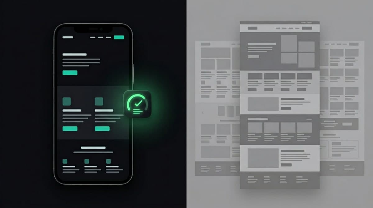
The biggest web design trend of 2026 is invisible: speed
Nobody screenshots a fast website for their Pinterest board. But speed is the one "design choice" with a direct, measurable line to sales.
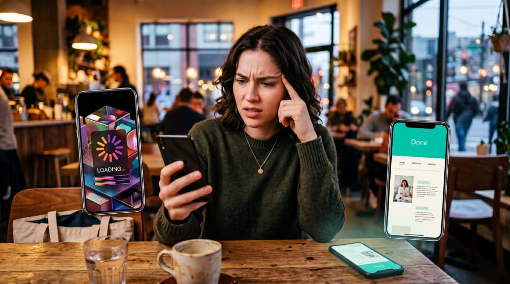
Your customer in Patna or Pune is on a mid-range Android phone, often on patchy 4G. Google's research has shown for years that as a mobile page goes from one second to three, the chance of the visitor leaving rises sharply. They don't complain. They just tap back and open your competitor.
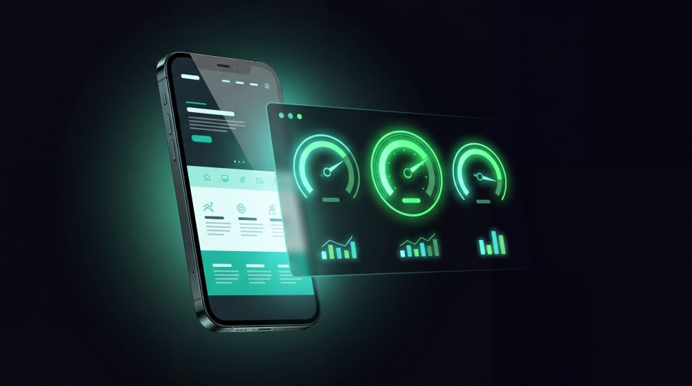
In 2026 the bar is formal: Google measures every site against Core Web Vitals — how fast your page loads, how quickly it responds to taps, and whether the layout jumps around while loading. Sites that pass rank better and convert better. Sites that fail pay for it twice: fewer visitors, and fewer of those visitors buying.
What this means for you, practically:
- Aim for a site that loads in under two seconds on a real phone, not on your office Wi-Fi.
- Compress every image. The 4 MB hero photo your designer loves is costing you customers.
- Be suspicious of page builders stuffed with plugins — they're the usual culprit behind slow Indian business sites.
- Test on your customers' network, not yours. PageSpeed Insights is free; run it today.
A redesign that takes you from "pretty but heavy" to "clean and instant" will usually beat any visual trend on this list. It's why we build on modern frameworks like Next.js as part of our web development work — the speed isn't a finishing touch, it's the foundation.
Our average build loads in under 2 seconds — and we put that number in writing before we start.
Get a Speed-First Website QuoteYour next visitor might not be human: AI-ready websites
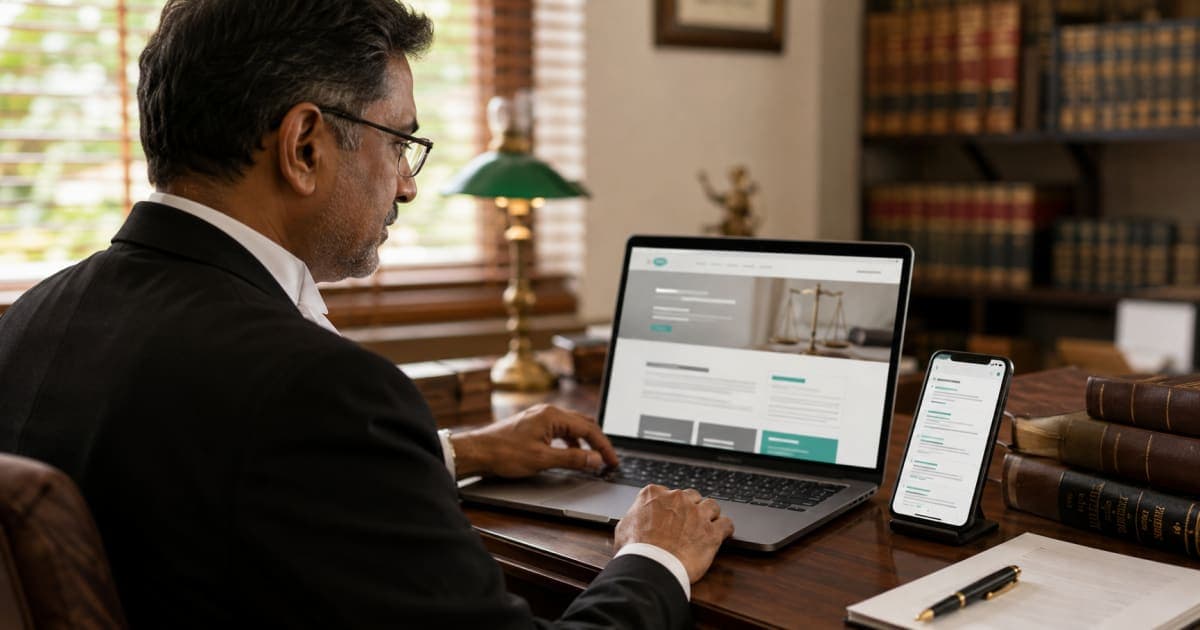
Here's the shift most trend lists underplay. In 2026, a growing share of your "visitors" are AI assistants — ChatGPT, Gemini, Google's AI overviews — reading your site to answer someone's question: "best CA firm in Ranchi", "interior designers in Lucknow with pricing".
If your website is a pile of vague taglines inside messy code, AI tools can't quote you, so they recommend someone else. The fix isn't exotic:
- Clear, factual content — what you do, where, for whom, at what range.
- Clean semantic structure and schema markup underneath, so machines can parse it.
- Real answers to real questions, the kind your customers actually type.
The industry calls this Generative Engine Optimisation (GEO). Call it what it is: writing and structuring your site so both Google and AI assistants can confidently recommend you. Plain-spoken pages beat clever ones here — which is also an argument for professional content writing over copy-paste filler.
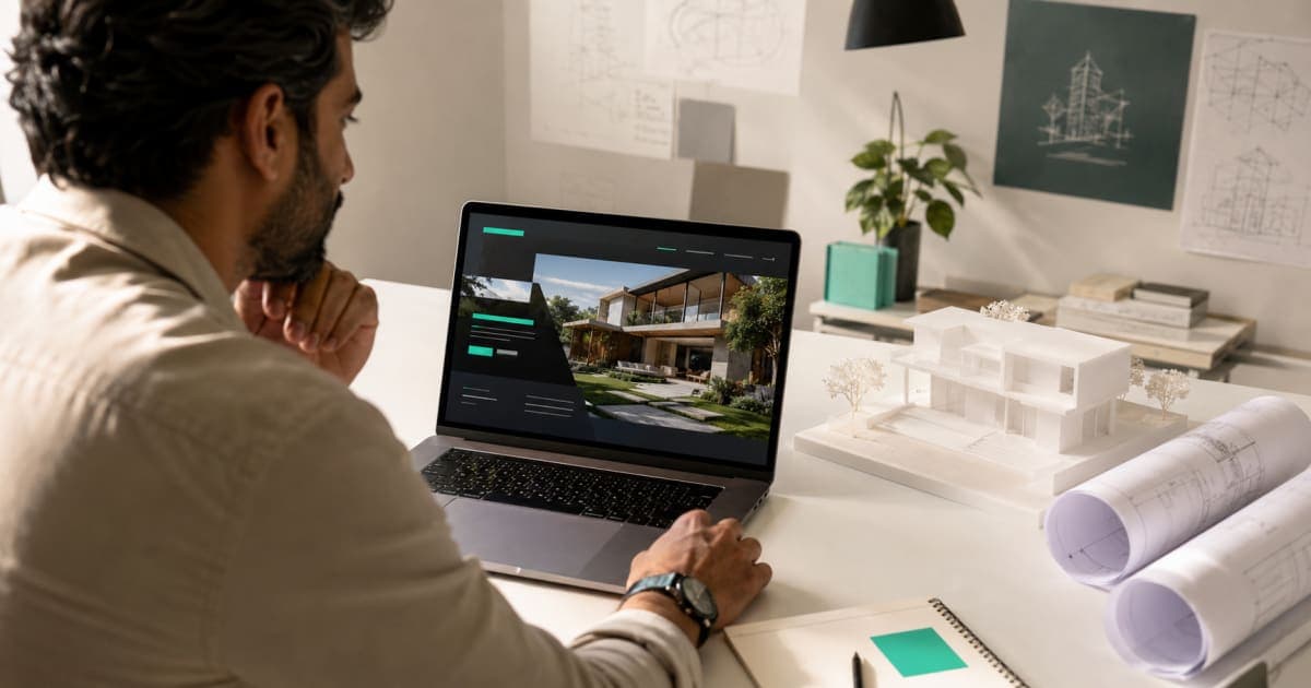
Bold typography and colour that doesn't look like everyone else
Open ten Indian business websites tonight. Same template, same stock photo of a handshake, same blue. A visitor can't tell your firm from the next tab over — and forgettable is expensive.
The strongest visual trend of 2026 is a reaction to that sameness: big, confident, custom typography and colour palettes with an actual point of view. Look through the winners on Awwwards and you'll notice the type is doing the talking — oversized headlines, characterful fonts, generous space around them.
You don't need an award. You need the business version of this trend:
- One distinctive typeface pairing, used consistently everywhere.
- A colour system that's yours — not "SaaS blue" because the template shipped with it.
- A homepage headline that says what you do in one line, set large enough to feel like a statement.
This is brand identity work, not decoration. Done once, properly, it makes every ad, card and brochure after it cheaper — because a real visual identity system gives everything a family resemblance. The dopamine-bright "Y2K revival" palettes trending on Behance? Fun for a sneaker brand. Wrong for your CA firm. Borrow the confidence, not the costume.
If your website could be mistaken for a competitor's, your brand identity needs work — not your luck.
Build a Brand Identity That's YoursMotion that has a job to do
Animation on websites has split into two camps, and 2026 made the split obvious.
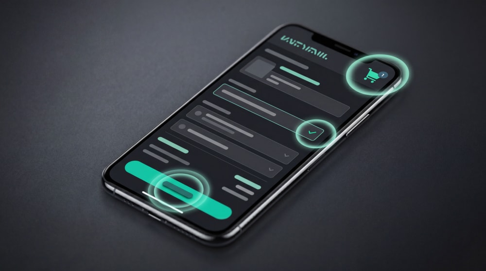
Camp one: micro-interactions. The button that responds the instant you tap it. The form field that gently flags a wrong phone number before you hit submit. The cart icon that nudges when an item lands in it. Tiny, fast, almost subconscious — and they measurably reduce confusion and abandoned forms. This camp earns money.
Camp two: the five-second loading animation, the homepage that hijacks your scroll, the cursor that turns into a glowing orb. This camp wins design awards and loses customers, especially on mid-range phones where all that JavaScript turns into lag.
Three questions before you approve any animation
- Does it help the visitor do something — find, decide, buy — or just look clever?
- Does the page still load in under two seconds with it?
- Does it work on a ₹12,000 phone?
Yes to all three: keep it. Anything that fails question one is decoration wearing a productivity badge. The same discipline applies to video and motion graphics — a sharp 20-second animated explainer on your homepage can do more selling than three paragraphs, but only if it's built light and starts muted.
Want motion that guides customers instead of distracting them? That's exactly what we make.
See Our Motion Graphics WorkWeb design trends 2026 won't reward: the noise list
Now the part agencies rarely say out loud, because these trends are profitable to sell.
Heavy 3D and "immersive" WebGL scenes
Spinning 3D products and full-screen WebGL worlds dominate trend lists every year. For a global sneaker launch with a film-grade budget, fine. For a business site that needs to load fast for a customer on a train in Jharkhand, a heavy 3D scene is three extra seconds of load time spent impressing nobody. They came for your price list.
Scroll-hijacking and cursor effects
When a site overrides how scrolling works, visitors don't think "premium." They think "broken." Cursor trails and magnetic buttons are designer-to-designer signalling — your customer is on a phone and doesn't have a cursor.
An AI chatbot stapled to every site
Yes, AI chat can be useful — on a 5,000-product store or a busy clinic. On a 6-page business site, a chatbot that answers worse than your own FAQ page is friction with a glowing icon. A visible WhatsApp button converts better in India anyway, because that's where your customer already lives.
The pattern behind all three: if a trend makes the visitor work harder or wait longer, it's noise — whatever the showreel looks like.
So… should you redesign your website in 2026?
Honest test, three checks. Open your site on a phone right now.
- Did it load in about two seconds?
- Can a stranger tell what you do, and contact you, within ten seconds?
- Does it look like you — or like a template with your logo pasted on?
Pass all three and you don't need a redesign; spend the money on marketing instead. Fail any of them and you're losing customers quietly, every single day — and a redesign built around speed, clarity and identity (not around trends) will likely pay for itself faster than any ad campaign.
Web design trends 2026: the questions everyone asks
What are the biggest web design trends in 2026?
Speed-first design measured by Core Web Vitals, AI-readiness (sites structured so AI search tools can recommend them), bold custom typography, and small purposeful micro-interactions. Heavy 3D scenes and scroll-hijacking effects are fading because they hurt conversions.
How much does a website redesign cost in India?
A well-built business website in India generally runs from about ₹20,000 to ₹1.5 lakh depending on pages, custom design and e-commerce needs. Be wary of both extremes — ₹4,999 template jobs that load slowly, and ₹3 lakh showpieces where the budget went into effects rather than results.
Do design trends actually affect sales?
Some do, most don't. Trends that reduce effort — faster loads, clearer layouts, instant feedback on taps — consistently lift enquiries and orders. Trends that add spectacle usually do nothing measurable, and on slow connections they actively cost you customers.
Will AI replace web designers in 2026?
AI has replaced the bottom of the market — generic template sites are now nearly free. What it hasn't replaced is judgement: knowing what your business should say, how it should look, and what to leave out. That gap is where good designers earn their fee.
The only trend that never expires
Fast. Clear. Unmistakably yours. Every trend worth adopting in 2026 is just one of those three wearing new clothes — and every trend worth skipping fails at least one of them.
Your customers are already searching. The only question is whose website earns them.
Not sure which of these your website needs? Book a free 20-minute call — we'll audit your site and tell you honestly, even if the answer is "don't redesign yet."
Book My Free Website Audit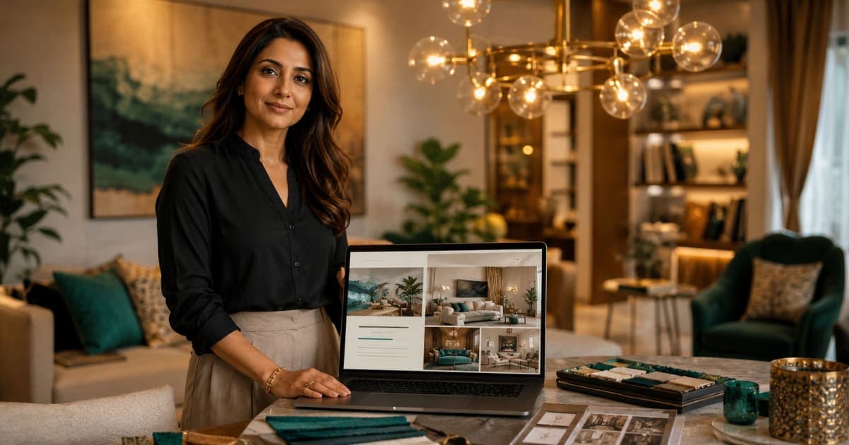
Comments0